Five Solves for Powerful and Effective Email Signature Design
Building an email signature can be overwhelming; if you’re inexperienced with design, it can be easy to worry about whether you’re making the correct decision when you choose how your team’s signature should look.
To help, we’ve prepared a set of best practices to follow when creating your signature.

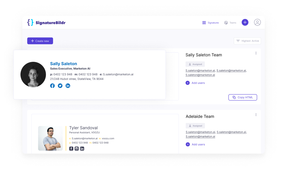
Signature Builder Makes Great Signature Design Easy
With designer templates from a team of web design professionals and the tools you need to easily make adjustments based on your brand, Signature Builder gives you the power to make HTML signatures without the hassle.
You’re in complete control with Signature Builder, helping you to make the decisions that are best for your business.
.png)
Keep it short and keep it simple
A less invasive signature tends to be more trusted when seen by a potential customer, so it’s best to keep your signature’s text short and overall easy to read. Try not to include more than nine or ten pieces of information or links in total (your name, your title, a link to your website, your phone number, etc.). If you feel like you need to include more, you could try including a link to your contact or staff page from your company website.
Consider what could be relevant information
One of the greatest boons of a signature is that it grants the recipient a way to access things like your title, phone number, and website links. But it may be helpful to consider what information is valuable to the recipient when you make your signature. For many organizations, most customers aren’t going to find your company’s address useful, for example, and this could take up valuable real estate.
Make careful use of images
Images in your signature can be eye-catching, but be careful; too many images or images that are too distracting can dilute your brand and make you seem unprofessional. Avoid using GIFs unless you’re sure. Instead, try to include pictures that mesh well together with your brand overall (encouraging team members to use a clean and straightforward photo for their headshot can be very impactful).
Include your most important social links
Connecting users to your social media accounts can be a powerful way to build your brand, but including absolutely all of your social media links can draw attention away from your most important social platforms. If possible, try to limit your included social media links to two to four.
Stay on brand
Finally, when constructing your signature, try to keep the design as lined up with your brand as possible. Including your brand’s primary colours in essential segments such as the name or title, using your brand’s web font, and including your logo can be great ways to leverage the ways your signature can help build brand recognition. It can be tempting to make exciting decisions despite your company’s brand, but when you choose between something on brand and something off-brand, you should always try and choose the on-brand option.
Avoid Costly Mistakes And Perfect Your Email Signature
Bad email signatures can do a lot of harm for your company and your brand; it tells potential customers that you're unprofessional and that you don’t care about their time. Many first impressions are made via email, so getting it right is paramount if you want to successfully turn a prospect into a lead.
Get started for USD $1.80 per user per month*
Signature Builder is inexpensive and powerful. Add your team packs for just USD $9 for 5 users.
Got a jumbo team? Speak to us for generous volume discounts for more than 50 users.
*Minimum single 5 user pack per purchase required. USD $9 per month, $1.80 each.

